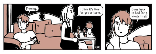
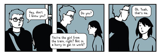
Shayna Marchese is the creator of Voids, a webcomic about Sara, a young woman in New York City. I like Voids a lot — it's a quiet comic that casts a careful eye on its main character as well as the city she lives in. I caught up with Marchese via email earlier this month to find out a little more about her and Voids.
Can you tell us a little about yourself? Where are you now: where are you from?
I'm originally from New Jersey; I moved to New York City about ten years ago to go to college (and escape the suburbs), and have bounced around between Queens and Brooklyn since. I currently work in the world of publishing as a graphic designer.
You have a webcomic called Voids that you've been serializing on your website. When did you come up with the idea for the comic and when did you start posting it to the web?
I came up with the idea in maybe 2002 or 2003, but didn't do anything with it. I knew I wanted to do something with comics but never managed to get started; then I drew the first 24 pages in late 2004 (each "part" is 24 pages long because I was thinking print, not web when I started). I didn't know what to do with a print comic no one would have ever heard of, so I began posting it on the web in early 2005.

The first thing that really got to me in reading Voids was the artwork. You work with a very simply color scheme – I think it's always one color per page – and yet at the same time you've got a lot of detailed line work going on. What went into your decision to use this approach for Voids?
I only use one color per section; when I was still thinking of it as a print-only project I envisioned it as being black and one shade of grey. So then translating it to the web I thought of using just black and one light color. I thought the simplified color scheme would work with the overall mood, and in other work I tend to try to keep things to just a few colors. The linework has gotten more detailed in the more recent parts; there's definitely been a progression in the artwork and part of that has been spending more time on backgrounds and settings.
 I go back and forth as to whether your art cools and distances the reader from the emotional state of your characters or helps to reveal it. On the one hand the muted, single color pages feel cold on initial view but your panel layout, line work and character design really often bring home the characters melancholy or just ambiguous emotional states. What do you think your artwork brings to the story you're trying to tell?
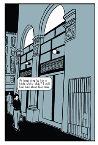
The story is centered around a very melancholy main character and I try to let the artwork reflect that. It's told from her point of view and if it was from another character's it would be very different. Sara's New York City is much quieter and emptier than might be expected (hence using muted colors); she's somehow always on the outskirts of things, taking long train rides from far-flung places, rather than Times Square's bright lights and big crowds.
The story in Voids hangs around the main character Sara who you describe as an early twenty-something. You list in your cast page for here: "Occupation: She just returned to working in a bookstore, after quitting a job in a studio because she hated her boss." Not a lot is actually happening in Voids but I imagine that's intentional as Sara's meandering is reflective of what it's like to be twenty-something. Is there a plot you have in mind? What's the long term shape of Voids when you think about the ultimate finished project?
There is a plot I have in mind and there is an ending (though I can't promise it will wrap things up neatly). The story definitely meanders but characters are being introduced and relationships built that will mean more later on. It's set up to be nine chapters; currently it's nearing the end of six. I'd like to somehow put it all together at the end, but there's a lot I'm not happy with, that I want to redraw or rework, so we'll see.
I recently read the other webcomic you host on your site, Gramercy Park. I checked Wikipedia and it says "Gramercy Park is a small, fenced-in private park in the Gramercy neighborhood of Manhattan, New York City, New York State. The park is one of only two remaining private parks in New York City with almost no access to the public." The comic is a short story about you living in a dorm across the street from the park. Is it a true story?
The comic concludes with you saying "I still have never been inside that park." Was there any significance or symbolism to you about the park you were trying to convey with the comic?
Gramercy Park is true — at least as true as it can be as I'm remembering it several years after it happened. I remember my parents being rather upset that I didn't call them at 3am to let them know I was okay (I wouldn't have thought they'd find out about the fire from the next morning's paper). It's true that I've never been inside the park (and seeing as I don't live there now wouldn't be able to). The story's about a death, but it's an unknown death, and the park's also an unknown. It's being close to something but still not really knowing it; there's a distance, a separation. The park's also at a distance: it's very pretty, but being near it feels sort of off — it's almost too pretty. Hardly anyone's inside, pets aren't welcome; even during those few months when I had access to a key, I didn't feel welcome.

You've posted on your website photography and paintings you've done. How does making comics fit in for you with your other artistic pursuits?
I'm not sure where the comics fit; I haven't painted in a while so maybe they've taken the place of that. Photography's more of a hobby, but it helps a lot when I'm trying to come up with realistic environments for comics. I often use neighborhoods in which I've lived as settings in Voids; I'll go back and take a bunch of photos that get used as reference. There are things I'm drawn to photographing, like bits of architecture or subway stations, that find their way into my comics.
Who are your influences? Comics specifically and then more broadly on your artwork (comics and other)?
I started making comics while I wasn't really reading too many comics, but some comic creators I really like are Seth, Guy Delisle, Jason Lutes, Bryan Lee O'Malley, and Marjane Satrapi. For other art, I love Paul Klee's watercolors, Ed Rushca's photographs, El Lissitsky's design work, and Max Beckmann's paintings.
Comments are closed.