So, here I am, a student at a liberal arts college, majoring in a liberal arts department. Part of this department’s "cool" is that its logo involves an interwoven Hebrew Aleph and Greek Omega.
Yes. It’s that kind of major.
After two years of this, you might think that I’m ready for some concrete, real-world learning. Yet from personal experience, I can tell you that I am gaining in something that will help me throughout my adult life. Screw employability! I’m not paying over $30,000 dollars a year to qualify myself for a paycheck, my friends! I’m paying for a lifetime supply of high-minded pet-peeves.
 Before I start in on how this connects to webcomics (oh please god let her start talking about webcomics soon), let me inform you that I am nowhere near being the worst offender on this front. One department-mate of mine is no longer on speaking terms with Pablo Picasso because his drawings of Don Quixote and Sancho Panza perpetuate something. I don’t know what they perpetuate; they just do.
Now, my friends, those guns have been turned on you.
I am a webcomics evangelist (partially because I get paid for doing them. …wait, is this mike live? Oh sh-). I force them upon unsuspecting victims for the thrill of watching the addiction gradually seize hold. That said, it would be nice if, one of these days, I didn’t have to apologize for the boneheaded mistakes that characterize this seamy little underworld.
I’m not talking about the plain old awful webcomics, or comics that get abandoned after 12 pages because the artist was oil-painting each individual panel and trying to write in their third language**. There are plenty of those. What I’m talking about here are the little chips, dings, and innocent snafus that grind down a well-written, well-drawn, and well-maintained comic, much less one just getting its sea-legs.
So this is a quick, easy run-through on things that I hate. They won’t kill you: but they’ll make me twitch. And when I twitch, bad things can happen.
STUPID GRAMMAR MISTAKES.
THEIR/THEY’RE/THERE.
THEIR = possessive. "Their horrendous mistakes make me want to puke on their shoes." THEY’RE = THEY ARE. "They’re scoundrels, and I smite them." THERE = a place. "You know Japan? I hear they make good comics there."
IT’S/ITS.
IT’S = IT HAS or IT IS. "It’s clear that he’s a blight on the face of webcomics. It’s been a tough decision, but we’re going to euthanize him." ITS = possessive. "As for my webcomic, its art and writing are both crap. If it weren’t digital, I would burn it."
YOU’RE/YOUR.
YOU’RE = YOU ARE. "You’re a blight on the face of comicsdom." YOUR = possessive. "Is this your egregious grammatical error, you blight on the face of comicsdom? I smite thee!"
WHO’S/WHOSE.
WHO’S = WHO IS. "Who’s your daddy, you blight on the face of comicsdom?" WHOSE = possessive. "Whose egregious grammatical error is this? Yours? You bastard!"
…got it? If there’s an apostrophe, it’s two words being squished into one. If there’s no apostrophe, it’s generally a possession. Check? Check. Last one, I swear:
ME/I.
Classic errors:
"Me and Emily hate webcomics." "Comixpedia tells Emily and I that we are slatternly fools."
The real way to do it:
"Emily and I hate webcomics." "Comixpedia tells Emily and me that we are slatternly fools."
Pretend that the other person isn’t even in the sentence: then choose I or Me accordingly, and stick ‘Emily and’ back in front of your choice.
Or somebody else. Emily doesn’t have a monopoly on these things***.
STUPID SPELLING MISTAKES.
Marilyn vos Savant, the super-IQ genius woman who writes that deeply annoying puzzle-solving column in Parade magazine (and who also, incidentally, slammed Picasso), once put it perfectly.
"I am a good speller," she said, "because I know when I can’t spell a word."
If you yourself were not kissed by the omniscient spelling fairies on midsummer’s eve, please, use spellcheck. If you’re doing your lettering on the computer, you have no excuse: slap your text into an word-processing application, run it through the ringer, and go forth into the world knowing that you’re not going to come off like a bonehead for misspelling the word "trouble" or "weigh".
STUPID FONT MISTAKES.
ARIAL = bad. This is a sharp, technical font that looks great on websites, but completely disrupts line art in the context of a page. It also gets blurry when made very small. The same goes for many other traditional text fonts, like Courier New. They’re meant for a paragraph, not a text bubble.
COMIC SANS = still bad. While this is a more acceptable font, even styled after classic comics lettering, I caution against it. It’s like printing your wedding invitations in Times New Roman; it’s clear you didn’t put much thought into it. If you want a "cartoon" font, Blambot is well-equipped and has stuff for free.
Otherwise, think of making a font from your neatest handwriting.
INSANELY DRESSY DISPLAY FONTS OR CURSIVE-Y HANDWRITING FONTS = pretty much the child of Satan when used anywhere except title graphics and the occasional on-screen "letter".
Above all, choose lettering which is (a) legible and (b) matches the feel of your art. Trust me: people care about it.
STUPID WEBSITE MISTAKES.
Yes, it can seem like an enormous bother, but link each page from the next. Smart readers know to just insert the next number in the address bar, but a lot of people don’t. Having a "next page" button adds professionalism and ease of navigation. It also means you don’t have to link each individual image on your "index of contents" page.
If you’re looking for a free webhost and have HTML-linked pages, choose one which does not use pop-ups. Every page a new pop-up! AGH YOUR STORY WAS KILLED BY GEOCITIES.
Do not use yellow text.
Do not use red backgrounds.
Do not use animated GIFs unless they are very, very well executed, and unobtrusive.
Do not use frames unless you are a genius.
Do not use scraggy, 8-color GIF format images that chew up linework. Save in JPG format (unless you have large, flat blocks of color). Save at at least 50 quality. Do not save at 100 quality. Do not use "progressive scan" JPGs (the kind that wait to load entirely before appearing.)
STUPID MOVIESTAR MISTAKES.
Johnny Depp is way hotter than Orlando Bloom. Sorry, that’s just how it is. I knew you’d understand.
SO THOSE ARE SOME BASICS.
I’ll add the final disclaimer that I read and enjoy comics that commit many (if not all) of the above crimes. I goof up, too. Ultimately, if you have a very good webcomic, you can survive a whole lot of painful gaffes.
This does not make the painful gaffes any less painful. This isn’t your dayjob, sure. But it’s how you have fun and express yourself, I hope, so you might as well do it with both flair and accuracy. As you march forth to do battle with the legions of apathy, mediocrity, and under-recognition, this must be our battle-cry, with which to strike terror into the enemy’s icy, 56K heart:
I before E! except before G! as in "neighbor" or "weigh"!!!
YAAAAAAAAAAAAAAAAAARRRRR!
MORE:
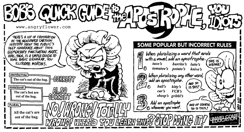
Bob the Angry Flower’s brief, adorable rant.
Rotten Tomatoes’ excellent grammar rant.
Mary Beth Kipler’s entertaining grammar guide. Yes, it’s made for writers of X-Files fanfic. That’s part of its charm. (No I haven’t written X-Files fanfic, shuttup.)
Mark Sachs’ "how to survive webcomics" tutorial.
Blambot Fonts for Comics.
NOTES:
**I tried to use French after only two years of classes. Mostly this just resulted in some mild hilarity, but trust me, there’s nothing like having 14 bilingual readers write in to correct your conjugations.
***Although there’s something charming about naming random characters Emily. The concept of a Dark Lord of Black Magic being called "Emily" is very appealing to me, probably because there’s a heatwave on right now and I just saw Pirates of the Caribbean for the third time. My synapses aren’t quite in their correct order anymore.
Yes, Johnny Depp is way hotter than Orlando Bloom, but only as long as Orlando doesn’t have ears on and he isn’t blonde. Otherwise, Orlando is much hotter. Ask any girl. It’s all in the ears. You put pointy ears on Johnny Depp and you have a real live bishounen. He just needs to shave. 😀
As for .gif. People have to know how to save them correctly. 😛 8 bit is perfectly fine for basic lineart saved adaptive//no dither.
Spelling: Spellcheck does not catch a lot of errors,.. it’s better to hand it to a friend before uploading it and have THEM spellcheck it. I should do that myself. 😛 But that’s fine.. my readers correct my spelling for me everytime I make a mistake. 😛
May I add:
LOSE (ends with a Z sound) = the opposite of WIN
LOOSE (ends with an S sound) = the opposite of TIGHT
e.g.
“You look like a complete LOSER when you confuse these words. Perhaps your collar should be LOOSER so as to increase bloodflow to your brain.”
Also:
LOSE = to missplace an object.
“It’s easy to LOSE one’s mind while reading poorly written grammar.”
Progressive Scan JPGs start loading when you hit the page and you can watch them load while non-progressive ones don’t become visible until they are fully downloaded. I’m guessing you want the former, not the latter.
Umm… speaking as a professional editor and English grad, I can assure you that “there” is NOT a preposition, neither in the instance you claim, nor in any other instance.
In the particular instance you highlight, it serves the role of adverb.
If one TRULY wanted to be niggling, they could add a comma after ‘comics’. Either way, the sentence you point out is, in fact, quite grammatically and syntactically sound.
A preposition is a “link word” (for, of, at, in, with, etc.), and that is why it is considered syntactially unsound to end a sentence with one — it is deemed odd to end a sentence with a leading word.
[/grammar lesson] ^_^
Hey, it’s no problem.
It’s all about learning, and I know that for all the knowledge I may or may not have, I’m still learning new stuff every day.
I.e., s’all good. ^_^
Nice Article – on fonts though, definitely try out the digital strip font that Nate does at Blambot!.
http://www.blambot.com
Ordinarily, I probably wouldn’t even notice this, but given the nature of this article I couldn’t help but point out the linguistic faux pas in the example sentence: “You know Japan? I hear they make good comics there.” As we all know, when spelled in this way, “there” is a preposition. In English, it is generally considered improper, if not incorrect, to end a sentence with a preposition.
You’re right. Mea Culpa.