Over the years, some graphic elements have become synonymous with “comics.” Foremost among these are speech balloons, thought bubbles, and panels. While they seem pretty straightforward in their meaning, these fairly ubiquitous signs can reveal deeper insights into each other and the medium as an expression of human thought.
On the surface, these elements both account for phenomena that is otherwise “invisible” to the graphic form: balloons represent speech or thought and panels demarcate the boundaries within and between events.
Yet, on a deeper level, both of these forms serve a common function: to encapsulate other information.
Stereotypically, panels hold images and balloons carry words. Of course, both of these norms can be broken frequently. Sometimes balloons will also contain images, and, more rarely, panels can contain only text (more commonly in manga, but still not unheard of in American comics).
Given how similar these elements are, we can make an even more radical claim about them: that they are essentially the same thing.
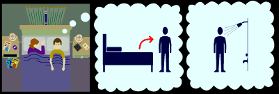
This similarity becomes clear when balloons can easily be turned into panels.

In a case like this, the panels carry the meaning of being “thoughts,” and not just “invisible” event boundaries. Indeed, it is an authorial choice in layout whether these balloons are represented as full panels outside the thinking person’s panel, or whether they are encapsulated by that panel.
Of course, the most apparent difference between panels and balloons then is that balloons often link to elements within the body of another encapsulating space (either another balloon or a panel). (Note though that the third panel above doesn’t even connect to the person in the first, but it still retains the meaning of “thought.” Here the tail is implicit.)
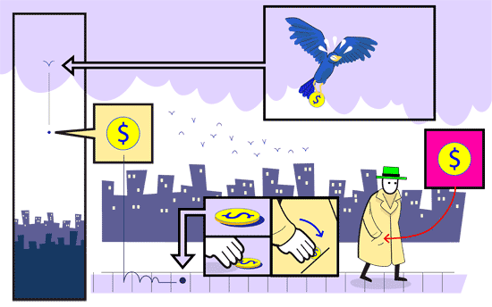
Though, even the “linking to elements” distinction breaks down in diagrammatic uses of panels, which also use connecting lines:

The fun thing about this “linking” aspect of balloons/panels is that it can also demonstrate one of the essential aspects of human cognition that has been stressed by linguists, starting with Noam Chomsky: recursion. Recursion is a phenomenon that allows for sentences to reach potentially infinite lengths, since aspects of structure can embed within each other.
A great example of this comes with a phrase like He said/thought/worried that… that can be added to the front of any sentence. Starting with a sentence like Gina likes comics we can add to infinite lengths:
Ray said that Gina likes comics.
Phil said that Ray said that Gina likes comics.
Yo mamma said that Phil said that Gina likes comics.
And on it could go…
Naturally then, we can do this same thing graphically:

Again, this type of representation is a choice in layout. It could just as easily been drawn as one balloon inside another, inside another, inside another…
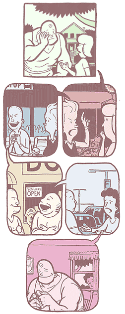
However, the graphic form allows an additional potential that is less available to the spoken form: it can loop this recursion back on itself. So, we can get a truly infinite loop out of the linking potential of graphic framing devices:

With every panel also a balloon that ties to someone in a previous panel, the sequence never ends! (…and starts at an ambiguous place too, I should add.) This type of sequence would be impossible to layout with each balloon embedded within the previous one, since the “final” balloon would need to connect back to the first.
Now, I think this alone is pretty interesting, but applying this function of panels (along with the associated meaning to speech or thought) to a sequence that might not otherwise have it can yield some pretty strange results in it’s meaning, like this:

While the previous sequences were dominated by the idea of speaking, this sequence conveys an action scene, with the panel modifications adding to the overall meaning in strange and perhaps unexpected ways. (An additional element to think about: in playing with my favorite question of “how sequences of images communicate,” do you find certain panels in this loop better or worse as the starting point for reading the sequence?)
These examples of recursion show that the graphic form can exploit a very fundamental part of cognitive functioning. However, are these the only types of recursive representations in the visual language used in comics? See if you can think of more and post links to examples here if you find them.
Notes: Thanks go to Tim Godek for illustrating the examples. For those interested further — the ideas in this article are based on concepts from my essay “Interactions and Interfaces” downloadable at emaki.net.
Comments are closed.