The Pen to Web Tutorial by Quinn Fleming

The Pen to Web Tutorial is a very basic resource for starting webcartoonists, covering the process of converting your pen-and-paper lineart into a fully-rendered comic strip using recent versions of Adobe Photoshop.

Part One – Getting your B&W

The Arrow Tool

Step 1 – The original image

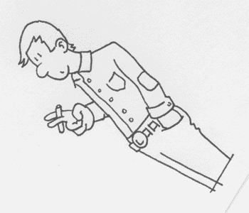
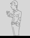
The first step in converting a drawn image to part of a digital (web) comic is to scan your image in. This has already been done for you. Rightclick and choose "Save As" to download it here. What we have is a grayscale scan of a black line drawing. It was scanned at 300 dpi; it’s always a good idea to scan and work big, making shrinking your image one of the last steps. This helps to give your images a smooth, more natural look.

The file has been saved in GIF format and grayscale mode, so it has been flattened (made to be one layer) and the color mode restricted (fixed to black, white and grays so you can’t use color). While in this mode it’s impossible to do the kind of edits you want to do, so the first step is to go to Image>Mode and select RGB Color.

Before you go on to the next step, go to Window at the top of the screen and click. This gives a list of the available windows to display. For this exercise, you should have the following windows checked off: Tools, Options, Layers, and the Status Bar. Feel free to have others open, but they aren’t directly necessary for this exercise.

Step 1
originalb&wcolorshading

Part One – Getting your B&W

The Arrow Tool

Step 2 – Orienting the image

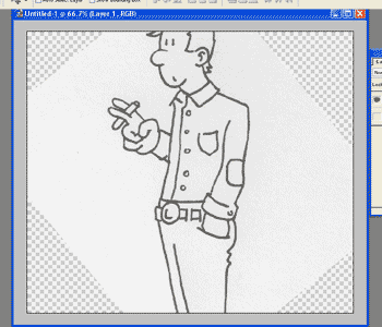
In this step, we’ll turn the drawing right-side up.

First, duplicate the Background layer by going to Layer>Duplicate layer. This is a very important function to remember; it duplicates the layer currently selected. In your Layers window, select the Background layer (the bottom one – the top one should be named Background Copy). Click on the eye next to the Background layer so that it disappears. This makes the layer invisible. Visible layers have an eye next to them, while invisible ones don’t; you can click and unclick the eyes at any time.

Before moving on, here’s a quick explanation of what layers are. (If you already know this part, skip ahead to the next paragraph.) A good metaphor for layers in Photoshop is very thin sheets of glass or plastic that you can draw or paint on. Another is a kind of collage; each layer is like a piece of paper on top of others that if you cut pieces out, you can see the other paper underneath. You can change the transparency of layers, the order (what’s on top of what), and add and subtract them without affecting the other layers.

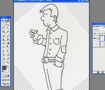
Double-click on the top layer in the Layers window. Rename it "Layer 1". Highlight Layer 1 and go to View>Fit on Screen (Ctrl+0). Then go View>Zoom Out (Ctrl+ -/Windows; Cmd+ -/MacOS). This resizes your view of the image so that you can see it all at once.

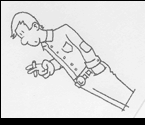
In your toolbar, select the arrow tool. Go to Edit>Transform>Rotate. Rotate your image using the cursor until the character is right side up. Don’t worry that his head and legs are cut off – they’re really still there, and we’ll fix that.

Step 2
originalb&wcolorshading

Part One – Getting your B&W

The Arrow Tool

Step 3 – Resizing the canvas

In this step, we’ll change the size and shape of the canvas so that it fits the drawing.

Go to Image>Canvas Size. In the popup window, change the units to pixels (if they’re not in pixels already). In the Width field, change the value to 800 pixels. In the Height field, change the value to 1000 pixels, then click OK. The size and shape of your canvas should change, and you can use View>Fit on Screen (Ctrl+0) to see the whole thing again. The guy should have his head and legs intact now.

Step 3
originalb&wcolorshading

Part One – Getting your B&W

The Arrow Tool

Step 4 – Getting rid of the grays

In this step, we’ll adjust the values in the image to make it black&white instead of gray&gray.

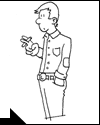
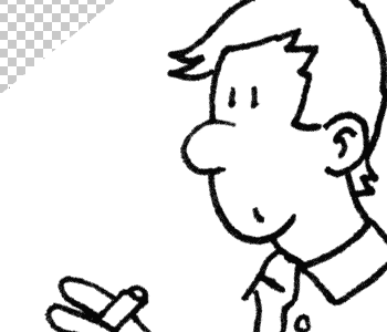
First, make sure Layer 1 is still highlighted. Next, go to Image>Adjustments>Brightness/Contrast. The Brightness slider changes how light or dark the image is. At -100%, the image is completely dark, and at 100% totally bright. The Contrast slider changes how much of a difference there is between the brightest bright and the darkest dark. At -100%, the image is middle gray (there’s no difference between the light and dark parts), and at 100% pure black and white with no grays at all. We want levels that will make the lines stronger and darker, while making the paper part of the image whiter. Adjust the brightness value to 35% and the contrast to 53% – that’s a good estimate for most black pen on white paper (though it depends also on your scanner). Click OK, and you’ve got yourself a black and white drawing to start with. The next step is color!

Step 4
originalb&wcolorshading

Part Two – Color

The Color Swapper

Step 5 – Setting up new layers

In this step, we’ll set up a layer structure for applying color.

First, select the Background layer. Next, go to the color swapper in your Tools window. If the swatches (those squares) aren’t black and white already, click on the miniature B&W swatches below them. This will revert the swapper to B&W. Next, click the little swapping arrows above the swatches to swap colors, making white the top color.

Go to Edit>Fill. The contents should be your foreground color (white, which you just picked), the mode Normal and the opacity 100%. Click OK. You just turned your background white.

Go to Layer>Flatten Image. In your layers window, you should see Layer 1 and the Background layer merge into one now just called Background.

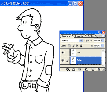
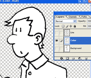
Duplicate the background layer by going to Layer>Duplicate layer. Finally, rename the top layer "Line" and the bottom layer "Color."

Step 5
originalb&wcolorshading

Part Two – Color

The Color Swapper

Step 6 – Making a line layer

In this step, we’ll subtract everything but the black lines from the Line layer.

Select the Line layer in the Layer window. In the color swapper, swap B&W again so that this time black is on top.

Go to Select>Color range. In the popup, turn the Fuzziness slider all the way up to 200 and click ok. You’ve just selected all the black in the image. Now, go to Select>Inverse. This command selects everything in the image that you weren’t selecting before.

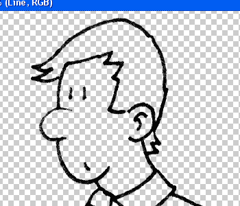
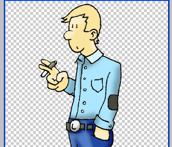
Finally, push the Backspace button. This deletes all the white in the image, so that all you have left is the black lines. To see it in action, make the Color layer invisible by clicking the eye next to the layer. You should see just the black line of the Line layer over a checker pattern (which represents transparency in Photoshop).

Step 6
originalb&wcolorshading

Part Two – Color

The Magic Wand

Step 7 – The color layer

In this step, we’ll prepare the Color layer before placing colors.

First, make the Line layer invisible and the Color layer visible. Next, duplicate the Color layer. A quicker way of doing this than the previous use of menus is to right click on the layer in the layer window and select Duplicate Layer. Rename the lower of the two Color layers something along the lines of "Background" so as not to mix it up with the actual color layer. Make the background layer invisible (so that now the Color layer should be the only one visible).

Fit the image to screen so that you can see the whole thing (Ctrl+0). Next, choose the magic wand tool. The magic wand is a selection tool that selects similarly-colored/shaded areas that touch each other. At the top of the screen, you should see a Tolerance option for the magic wand tool. Turn it up to 200. Make sure that the anti-alias and contiguous buttons are checked and the use all layers button is unchecked.

Now click the magic wand somewhere in the white space surrounding the character. It should select all the space around the character, but not the black lines or the inside. If it does select some of the inside portions, turn the tolerance down to 160. Once you have your selection, hit backspace to delete the surrounding white space. Go to Select>Deselect (Ctrl+D/Windows; Cmd+D/MacOS) to discard the selection.

Zoom out. Your character should be colored white over a transparent background.

Step 7
originalb&wcolorshading

Part Two – Color

The Magic Wand

Step 8 – Coloring

In this step, we’ll apply color to the image.

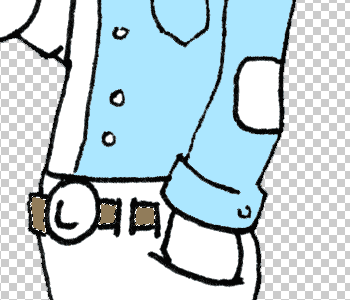
Take your magic wand and click in the middle of the white of the guy’s shirt. If your tolerance is still at 180, it selects both sides of his shirt and inside one of his front buttons: the tolerance is too high. Go to Select>Deselect (Ctrl+D/Windows; Cmd+D/MacOS). Change the wand tolerance down to 150 and click the right side of his shirt. Now, it only selects half the shirt and doesn’t pick up the inside of the front button. Go to Select>Save Selection. Call the selection something along the lines of "Right shirt," so that you’ll remember what the selection is of. Saving a selection lets you come back to it later, and this will be important for when we want to reselect certain parts while doing shading effects.

Now, click on the top square in the color swapper. The Color Picker window should come up. Choose the color that you want that part of the shirt to be & click OK. Go to Edit>Fill. This fills the selection with the color you just picked. Go to Select>Deselect. You just colored part of the comic!

What happens if you want to color several parts the same, like the belt for example? Select the middle section of the belt using the wand. Next, hold down the Shift button (the cursor should change to show a little + ) and click on the rightmost section. Both parts should be selected together. Holding down shift again as you click, click on the leftmost part of the belt. Unfortunately the lines don’t meet well enough and the selection spills out into the pants. Go to Edit>Step Backward (Alt+Ctrl+Z/Windows; Alt+Cmd+Z/MacOS) to undo that part of the selection. Your other two parts of the belt should still be selected. Turn the tolerance down to 130, and the last part of the belt should become selected without spilling over. Now save the selection as "Belt," choose a color for it, and fill.

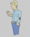
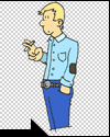
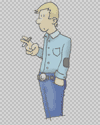
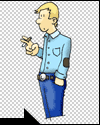
Use the select/save selection/color process over all the white areas within the drawing. Don’t worry if in some areas you have to turn the tolerance down to below 100 (like in the face); anything over 40 is fine. Once you’re done with that, make the Line layer visible again. You’ve finished coloring your comic!

Step 8
originalb&wcolorshading

Part Three – Shading

The Brush Tool

Step 9 – Shadow

In this step, we’ll add shadows to the shirt.

Make sure that your Line and Color layers are both visible, and that the Color layer is highlighted. Go to Select>Load Selection. Pick out the "Right shirt" selection and click OK. The selection you made to fill that part of the shirt should reappear.

Select the Brush tool from the Tools window. In the color swapper, make black your top color. At the top of the screen in the options bar, there should be a part that says "Brush" followed by a shape with a number next to it and a downward pointing arrow. Click on the arrow. You should see a menu that gives the option of different shapes and sizes of brushes. Choose one of the soft spraypaint-looking brushes (they should be the next options after the solid circular brushes at the top of the menu). Change your Master Diameter to 75 on the slider (this changes the size of the brush). Then, change the Opacity in the options bar to 30%.

Now, brush in some shading to the shirt. Notice that it draws only within the selection. Also notice that even though the color you’ve selected is black, it brushes on lightly because you turned down the opacity. Try brushing over a stroke you’ve already made. Remember that if you don’t like something you’ve done, you can always undo it using Edit>Step Backward (Alt+Ctrl+Z/Windows; Alt+Cmd+Z/MacOS).

A good rule of thumb about shading is to always do less and do it lighter than you think you should. Subtlety is typically preferable.

Step 9
originalb&wcolorshading

Part Three – Shading

The Brush Tool

Step 10 – Skin highlights

In this step, we’ll add a highlighted area to the face.

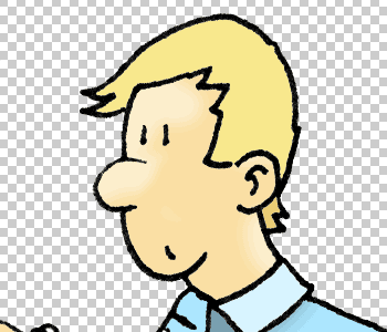
Load your face selection. Switch your color swapper to white. Pick the brush tool, and reduce the master diameter to 40. Bring the opacity all the way back up to 100%. In the Mode option, select Soft Light. Now, color in some lighter areas on the face. The same technique can be used to add highlights to other areas; feel free to play around with different modes and opacities – different materials look different under light.

Step 10
originalb&wcolorshading

Part Three – Shading

The Brush Tool

Step 11 – Finish it!

Go ahead and reload your coloring selections and apply highlight and shadow.

Again, feel free to play around with different modes and opacities – different materials look different under light.

Congrats! You’ve finished the tutorial.

Step 11
originalb&wcolorshading

Quinn Fleming is the creator of Clown Samurai. Ben Thompson and Max Kimbrough contributed to this article.