In this review, El Santo takes a look at Sarah Ellerton’s The Phoenix Requiem, a beautifully illustrated tale set in 19th Century England about a mysterious stranger who stumbles into an idyllic village.
The Phoenix Requiem, written and drawn by Sarah Ellerton, contains the following disclaimer in its "About" page: "This is a graphic novel, not a webcomic. It is not designed to bring instant gratification. It does not move fast. It is structured like a novel or a movie, beginning slow and working up to a dramatic finale. If that’s not your cup of tea, I suggest you go elsewhere and come back when it’s finished."
This sort of disclaimer tends to raise my hackles immediately. "Not a webcomic," eh? Even though the very definition is that a "webcomic" is a "comic on the web"? In the print world, insisting on a "graphic novel" label is the height of snobbery and elitism. Comic books are just so low brow. This is nothing of the sort; it’s literature! Sure, Tom Servo would be your best friend during the MST3K riffing of "Cave Dwellers," but he was parodying the sniffy attitude in the first place.
That said, I’m sure Ms. Ellerton meant no harm. Heck, she’s the one weathering the barbs and cruelty of the critics, not me! She just wants you to know that she’s building up to something in the long term, and the slower portions should only be viewed as a small piece of a larger tapestry. Picking apart a single page or series of pages is kinda like saying that The Godfather sucked because that one scene where Don Corleone talks with Johnny Fontane was utterly forgettable.
Still, if this review starts to sound a little prickly, be aware that Requiem‘s disclaimer opened some old wounds. I’ll resist the temptation to gird myself with the Breastplate of Nerd Self-Righteousness for now. However, I offer no guarantees that this review won’t devolve into a cacophony of literary references just to prove my nerd superiority (even though, to be frank with you, I haven’t read a literary masterpiece since high school English class).

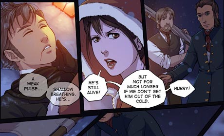
Thus far, The Phoenix Requiem is set in an idyllic town called Esk, which is located in what looks to be an alternate universe’s version of 19th Century Victorian England. It’s winter. The townspeople are getting ready for the All Soul’s Eve celebration. A mysterious, dapper stranger, by the name of Jonas, collapses in the woods nearby. He’s been shot. A couple kids discover his body. Jonas is treated by the comely local nurse, Anya. She’s filling in for an absent doctor, and, judging from her name and immigrant status, probably hails from an alternate universe’s version of Tsarist Russia. Meanwhile, a vaguely mystical air hangs over the town like a fog.
It’s All Soul’s Eve, after all, so there’s the inevitable discussion about spirits and deities. Robyn, a man who is totally crushing on Anya, is suffering from some spooky hallucinations. For example, in a fit of impotent rage, Robyn strikes a defenseless, load-bearing post with his sword, and the wood bleeds. Jonas himself has hazy dreams about his wife, who may or may not be in the realm of the living. And, in a scene out of an Oscar Wilde book (or Tales from the Crypt), one of Anya’s patients suffers a sever case of DEATH. Rapid, leprous decompisition, it seems.
The Phoenix Requiem garners a butt-load of praise and acclaim for its artwork. Ms. Ellerton nabbed an impressive 11 award nominations at the 2008 Web Cartoonists’ Choice Awards, including the "Outstanding Comic" award. Not bad, and very impressive for a comic that’s only been around since last September.

There’s no denying that Ellerton’s illustrations are beautiful. Requiem‘s style is similar to the work of comic book artist (and David Willis’ archnemesis) Pat Lee (Transformers, Warlands). The art is clean, manga-inspired, with a pleasing mix of bright and muted colors. Ellerton seems to have a keen interest in getting the period clothing just right. She doesn’t skimp on the details. For example, Jonas sports a lovely floral pattern on his waistcoat. Long, hanging swaths of cloth — whether they be neckties, skirts, or cloaks — fold, sway, and crumple with the character’s movements.
Ellerton also opts for backgrounds that take on the style of a traditional Romantic Era painting. This works wonderfully with Esk’s wintry setting. The snow seems so delicate and fluffy that you can see yourself falling into it or leaving footprints. Icicles crystallize on the tree branches, and warm breath leaves a lingering mist. Her rendition of a church, bathed in a warm, hazy glow, embodies an overwhelming sense of serenity. By coupling the soft backgrounds with the "cel-shaded" characters, Requiem takes on the lush characteristics of a traditionally animated Disney movie.
I have to give Sarah Ellerton a lot of credit: the Industrial Era is not that easy to illustrate in an appealing manner. It’s the era that brought us Oliver Twist and Upton Sinclair’s The Jungle. Most illustrations I’ve seen (mainly from the steampunk genre) depict a world covered in layers of black paint, soot, and grime. The clothes usually seem itchy and uncomfortable, and there’s enough rusting metal lying around to inspire you to get a tetanus shot every five days. Ellerton manages to retain most of the familiar visual cues while softening and brightening the setting at the same time.
In fact, my only quibble with the art is that the characters don’t ever seem to really emote. The characters may be angry, sad, horrified, or happy. Their facial and body expressions don’t show it. Is this meant to be a reflection on the stifling primness of Victorian England? Perhaps, but in the illustrated medium, it comes across as a needlessly stiff and frigid.
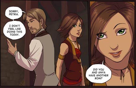
As an (unfounded an totally speculative) aside, I also detect the tiniest influence of the Final Fantasy series. Maybe it’s an homage, maybe it’s unintentional, or maybe I’m just seeing things because I only got 4 hours of sleep last night and I’m zonked on the extra-strength Ibuprofen. (A short list of things that remind me of Final Fantasy: the logo fonts, the coeurl-like woodland creatures, and side character Petria’s resemblance to FF8‘s Selphie Tilmitt.)
My main complaint about Requiem is the story itself. Let’s start with the characters. They don’t act like human beings… or, to clarify, they don’t act like adults. In one part of the story, Anya loses a patient. They story goes so far as to mention that it’s the first patient death she’s experienced. So what happens? Anya reacts with the same mild annoyance as if she discovered the bread had molded or someone had tracked muddy footprints all over her carpet. After the funeral, she’s back to giggling like a schoolgirl and accidentally falling into the arms of the devilishly handsome Jonas Faulkner.
How sweet.! No, wait a minute. I meant to say… WHAT? Now, I’m certain there are people like Anya in real life, but I wouldn’t want her to be contracted to my HMO, much less being the main female protagonist of a story.
And then there’s the general feel that, despite appearance to the contrary, everyone in the online graphic novel is roughly fifteen years old. Don’t be fooled by Robyn’s facial hair. At the slightest notion that the girl he likes needs to spend time with a patient, he’ll sulk off dejected-like, start smashing things while crying on the inside, and act snippy to a guy who, until very recently, has been on the verge of death. Grown man with a military service record or whiny little emo kid? All evidence points to the latter.

Finally, the critics are right: the story does move at a pace roughly equivalent to plate tectonics. Calling something a graphic novel doesn’t instantly give you license to move at a snail’s pace. In print novels, the first few chapters may be slower to give the reader time to acclimate themselves with the characters and to grasp the set up. However, and this is important, things happen. For example, in Great Expectations, Pip is chased by a wanted criminal, steals dinner, and is invited to a creepy old lady’s house in fairly short order. In the graphic novel field, Watchmen proceeds swiftly from the Comedian’s death to introduce us to all the characters, the paranoid world about them, and the heroes’ backstories — all before the first chapter comes to a close.
And yes, there are novels out there that have lengthy set ups. The action in Hunchback of Notre Dame and Jane Eyre don’t start until about long after the story begins. Both books are also mind-numbingly boring during their first halves. Quite frankly, they’re skippable until Esmeralda asks for sanctuary or Jane becomes governess. The similarly attractive webcomic What Birds Know suffers from the same problem: too many scenes of characters sitting and walking before the reader gets to the climatic egg scene.
Here’s the reality: The Phoenix Requiem is already over one hundred pages long. And here, we don’t have the luxury of skimming to the meaty (or so I assume) middle part, because it doesn’t exist yet. Though it’s a somewhat overused cliché, here was a nice hook at the beginning when a mysterious stranger stumbles into a small, isolated village. But what do we get after? Outside of a mysterious death, not much. There’s a lot of fat. The story could easily be trimmed down to half the length. If Requiem were a novel, the editor would be marking up whole paragraphs in red and scribbling down "unnecessary" over and over until his pen ran out of ink.
The Phoenix Requiem boils down to a series of attractively illustrated panels as the story itself spins it wheels. Ms. Ellerton may yet turn it around, but at this moment, the Requiem is an unsatisfying read. Perhaps, in a year’s time, if the story manages to move somewhere, anywhere, I’ll reverse my decision. Beautiful art, but no story? That’s a DeviantArt portfolio, not a graphic novel.
Comments are closed.