In an arena that’s crowded with elaborate Sci-Fi themes, baroque fantasy themes and byzantine plots, it’s refreshing to note that one of the best comics on the Web features two main characters who don’t even have arms.
The main characters of Steven Cloud’s Boy on a Stick and Slither are a sort of coalition of the limbless. Boy is either a multiple amputee or a sentient Pez dispenser, and Slither is a snake. In a boxing match, they’re on equal footing.
The fact that neither protagonist can wear a wrist watch is mostly irrelevant to the strip, though, as they’re essentially icons or stand-ins for any two people. They look like doodles from the corner of a Physics notebook, and conceptually, they’re the same. They’re symbols, really, and their visual representations are irrelevant, except as fodder for a self-aware gag or two.
The strip will never have a storyline about Boy’s awkward attempts to live in a society that isn’t always handicapped-accessible. In fact, the only running storyline involves a sentient tooth named Nancy battling injustice on the picket line. Instead, it’s mostly a clearing ground for dry quips on topics such as consumer culture, war, or corporate America. Or, sometimes, smoke billows out of Boy’s nose for no clear reason.
That’s not to say that Boy and Slither are characterless. Over time, Boy has developed into more or less the naive straight man, and Slither has become a cynical viper with a penchant for stinging Boy in the last panel. Character interaction is definitely not a centerpiece, though. Lumping BOASAS in with "gag" panels seems unfair, since that’s generally awful company for such a good comic, but the shoe fits.
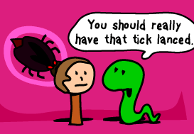 A little snooping in Google reveals that Cloud has a day job in advertising, and it’s apparent in the strip’s design consciousness. Cloud makes striking comics and seems very cognizant of color and layout. Aesthetically, the strip smacks of commercial art: full page ads and catalog layouts. It’s attractive and eye-catching. Any given day’s strip would look good on a T-shirt.
At root, the art is so simple that it would seem crude anywhere else, but it’s stylish in this context. The few thick lines used for the two main characters make them more universal and iconic. The backgrounds are typically simple thick brush strokes or fills of vivid, basic tones. The characters seem to be suspended above a painted stage backdrop in most panels.
Boy on a Stick and Slither rarely inspires laugh-out-loud amusement. It draws on a dry humor that’s too emotionally cool to belly laugh. Everything about it is distanced and ironic. The panels are more designed than they are drawn, and the dialogue is very much tongue-in-cheek.
To appreciate BOASAS, you have to be willing to leap to a higher level of abstraction than most comics manage to reach. The jokes are predatory and heartless, when they’re not just obscure. They’re much more likely to draw a knowing smirk than a laugh, and they have all the charm of dark humor in their absurd package. Only the terminally unhip would ever ponder how Boy combs his hair.
Recent Comments