There are certain webcomic genres that seem to dominate the online world as much as the superhero genre dominates print comics. Any simple search will yield a seemingly endless list of gamer comics, college life comics, fantasy comics, slice-of-life comics – the web comic genre list goes on and on. But it’s quite a different thing to search for comics that deal with the self as source – or what is more commonly described as autobiographical. Aside from examples created by well known webcomic authors (for example Scott McCloud’s My Obsession with Chess and James Kochalka’s American Elf), most webcomic creators seem to pass over this method of conveying a visual story.
There’s a very good reason for this – it’s hard to do, and you can louse it up easily.
Colin White’s Amicably Subversive contains a few semi-autobiographical stories dealing with his life. In total, there are four autobiographical stories available on his page; 48 Vignettes About Everything, Application to LCP, A Riot of My Own, and The Tintin Artifact. The comics available on his website are brief, and aside from the other strips available (that are not semi-autobiographical) the likelihood of future strips in the near future seems slim to none. However, the innovative use of flash on 48 Vignettes, and the gradual changes overall in White’s work are worth observing.
 The Tintin Artifact seems to be the earliest of the four- it lacks the sophisticated use of flash seen later in 48 Vignettes, and the artwork seems a bit rough when compared to the other stories. To navigate through the story, the reader clicks on each page to advance to the next. The plot is simple enough – a student (the author) procrastinates writing a term paper for class, then slaps it together at the last minute. It’s the largest (in image size) of the four stories as well.
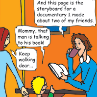
The writing is dense – there’s a lot of it, compacted into small word balloons that barely fit the dialogue. The lettering (given the amount of wording) is also small, in order to fit within the word balloons. Both of these could be forgiven if White exhibited a range of variation in his line work. His figures, the background, and even the panel borders in Tintin stay consistently the same width. The lines don’t go from thick to thin, they are either too thin to stand out amidst the color fills, or thicker than they need to be in one or two panels on each page. His composition in each panel however is very nice. It’s clearly his greatest talent in Tintin. This page is a good example of White’s ability to expertly place his characters within their surroundings.
The “click on image, go to the next page†layout is also how A Riot of My Own is presented (he uses flash instead of the image linking used in Tintin), however the artwork in A Riot of My Own achieves a consistency seen later in the next two strips. In A Riot of My Own the artwork becomes more stylized, and there is less of an attempt to make more detailed backgrounds. Also, White’s line work seems to stand out more against the brighter pallet he employs for this story. The pages are also smaller than Tintin, and the lettering is clearly White’s own handwriting, which is nice when compared to the font used in Tintin. However the "plot" (once again, about his procrastination in completing a project) goes nowhere, and is merely there to support the artwork.
 Application to LCP is the first story in which White really begins to do something (besides telling terribly mundane stories) with his work – he plays with layout & story progression. The story, designed as an application portfolio for the London College of Printing, allows the viewer to read the story and view pages of his sketchbook. Essentially, whenever a journal (or piece of paper) appears in a panel of the comic, the viewer can click on it and be taken to a new window, where a sketchbook example will appear. The technique is neither earth-shaking nor novel, but it does bring a little bit of life to the narrative. But while we’re on the subject, his drawing style in these sketchbook examples really is wonderful. The variation in line that is absent within the pages of his comic narrative) abounds in these rough sketches.
 Finally, 48 Vignettes about Everything uses flash to navigate throughout the entire story. The square format of this story was already pre-determined by his class project, however he does use himself, friends and fellow classmate as subject matter. The artwork is simple, and the coloring is somewhere in between the bright colors of A Riot and the pastels seen in Tintin. The narrative however, is reminiscent of Tom the Dancing Bug – it connects sixteen people (fifteen friends and the author), sixteen countries and sixteen objects together, often with quirky, pseudo-facts (regarding the countries and objects) in a way that makes it a game to shift between people, objects and countries in order to read through the narrative. It is a complete departure from his other three stories.
Unfortunately 48 Vignettes was the first story I read – which may be the reason why the other three seem such a letdown. It just feels more natural – as if White has finally come up with a way to convey all those stray thoughts that flit in and out of his head. The kind of thoughts that can only caught occasionally within a sketchbook. It’s just a shame that it has taken three years for White to produce the small amount of work that appears on his site.
Recent Comments